10min read
Welcome to another year of she will viz. This is my third year publishing interviews with women in data viz and I hope this year I can share more stories and data viz inspiration with you. Thanks to all the women who have so generously shared their stories so far.
In my first interview for 2025, I’m honoured to have fellow Aussie and all round talent, Heather Cox share her story. Heather is a Tableau Public Ambassador, 4x Tableau Public Viz of the Day recipient and her TableauVision viz was recently selected by the Flerlage Twins as their favourite viz of 2024!
Kimly: Thanks for being on she will viz, Heather. Firstly, how did you get started in data and data viz? Was it always something you have been interested in?
Heather: I started a degree in IT and Data Analytics, because I had liked working in IT, but I had really enjoyed the challenge of coding, and this degree was the only one that would work around my family commitments. And while I enjoyed the coding aspects, I had been very excited by the data classes – data structures, big data analytics, statistics. I started applying for graduate roles in data for the year after I finished the degree, but I only got one invitation to an interview. Around the same time, I started the last class of my degree – Data Visualisation.
The first interview led to a second, and then a third. Meanwhile, I was really enjoying Data Visualisation, and we were going to touch on Tableau, the same tool being used by the company I was getting along so well with!
That’s when things got really freaky: I didn’t get the graduate role I interviewed for, however, I couldn’t really be disappointed, because I was offered a different role in the organisation, supporting efforts to uplift processes around the Tableau Server.
Kimly: When we were first chatting, you mentioned that you are neurodivergent, how does that influence the work that you produce and how you approach your vizzes?
Heather: For me, I think neurodivergence shows up in my vizzes as sheer intensity. Something I interact with will spark an idea, and it might be something mundane that I’ve just seen differently, because of how my brain works differently, but once I’ve decided to viz it, the project becomes all consuming! The vast majority of the vizzes I start make it to completion, though they might not end up looking how I planned. I’ll keep working on them until I think they’re ready, and I’m on the perfectionist side, so that can take a while. I’ve learned so much from just not being content with a default setting or standard behaviour, and researching how to do it differently.
…it seems like the community is already a place where neuro-spicy folk feel comfortable being themselves and sharing their neurodiversity.
Kimly: How can we in the datafam and data communities help support the neurodivergent community and the challenges they might face?
Heather: The datafam are incredibly welcoming to everyone, and I’ve noticed a higher incidence of neurodivergence than in the background population – it seems like the community is already a place where neuro-spicy folk feel comfortable being themselves and sharing their neurodiversity.
Kimly: Do you have any advice for other people who are neurodivergent and want to get involved in the Tableau community?
Heather: For neurodivergent people, or anyone, really, I would recommend just jumping in. Attend a TUG (Tableau User Group), join a conversation on social media, get into the forums: we all love meeting people who share our special interest, so you will definitely be welcome.
Kimly: I have noticed that some of your vizzes are quite technical and it frankly blows my mind. For example your TableauVision viz. I thought was a technical masterpiece. But it was also beautifully designed. How did you balance technical mastery with design?
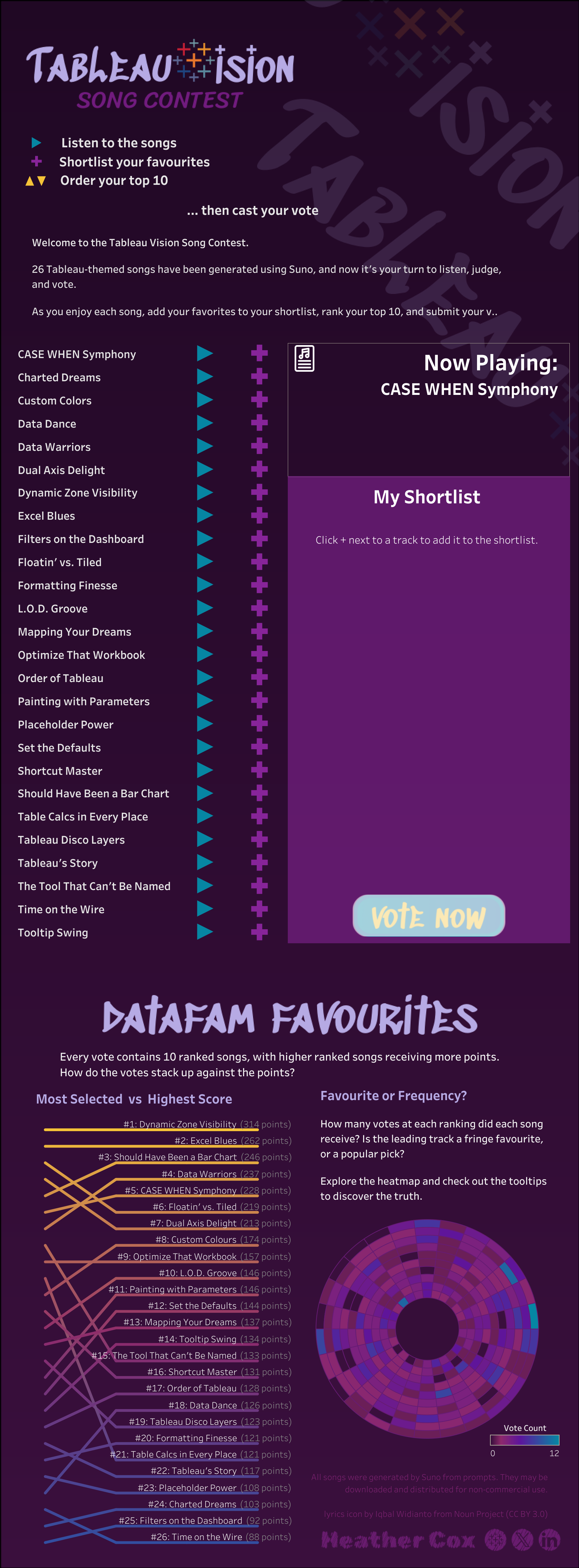
TableauVision Song Contest on Tableau Public
Heather: Thanks! Both the design and the technical aspects of that viz were determined by the function. TableauVision was the public version of something I built for our family’s school community, and I was focused on the user experience. My users were not necessarily familiar with Tableau, and were likely to be accessing the viz on a phone, so I needed to have it function more like an app, and that meant I needed to use parameter actions rather than the usual parameter controls to provide the functionality, and then I needed to make sure that those highlighting quirks you get when clicking on shapes got cleared before my user tried clicking on the next shape that I was using as a button.
Kimly: What was your learning path to Tableau? How did you gain the technical skills that you showcase in your vizzes?
Heather: When I first started using Tableau, I learned a lot from colleagues, one of whom forwarded an invitation to the Analytics TUG, which was my first exposure to the community. I started learning from all the amazing community content, but it wasn’t until I started publishing to Tableau Public that I really started developing technical proficiency. Practice was a major factor – stakeholder management is an essential part of producing Tableau reports in a corporate environment, but it is time consuming, and I spend a lot less time actually building vizzes at work than is needed to improve my skills at the rate that I wanted to improve. With personal projects, I get to pick the topics, the data sources and the details of how it’s all presented, and that’s where being stubborn is my key learning tool: I have a hard time giving up on a great idea just because it’s not easy to achieve, so I will research and experiment and sketch and calculate and think, then rinse and repeat. Sometimes, I stumble onto a better solution than what I had in mind. Sometimes, I can’t find a way to make it work, and have to go back to the drawing board entirely. And sometimes, I figure it out and bring my idea to life. But regardless of the outcome, the struggle makes that knowledge stick, and I can then build on it to learn and do more.
Kimly: Let’s talk about your viz Safety in Numbers. I really love the eye opening data behind this topic. You mentioned the book Invisible Women by Caroline Criado Perez as inspiration for the viz. Did you have any other influences for this viz?
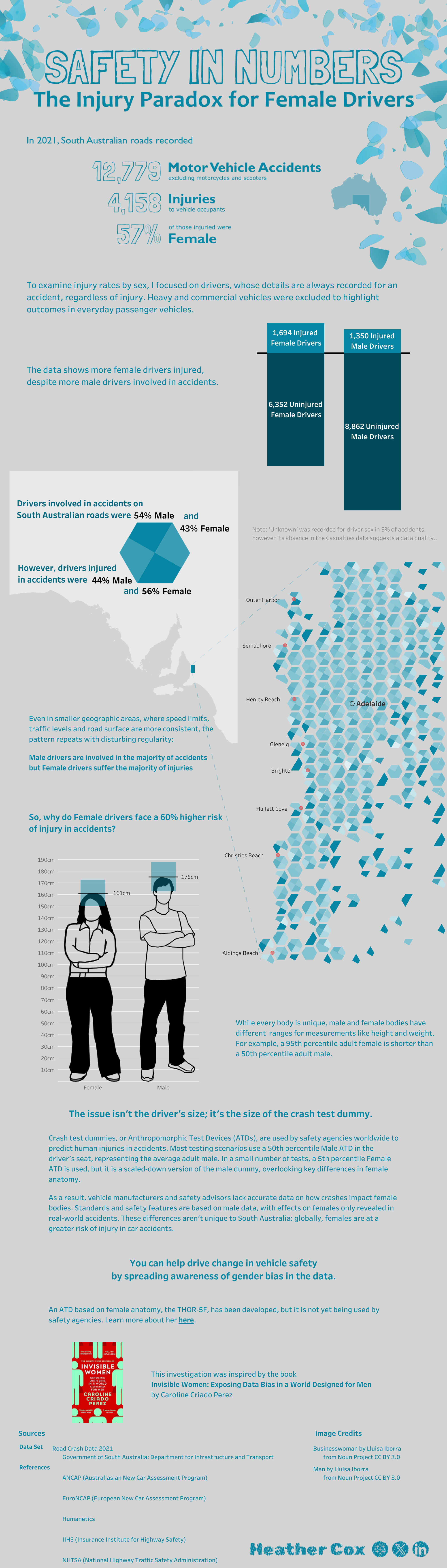
Safety in Numbers on Tableau Public
Heather: I’d been trying to represent the disparity in crash outcomes for female drivers for a while – I’d even experimented with data sonification – but I hadn’t found a way to communicate it clearly. In July, I was looking to get some practice for Iron Viz, and saw the Data + Women VisualiseHER competition. That same month, the Iron Quest topic was Maps, and the timing brought the two concepts together for me – using maps to represent the gender disparity in crash statistics. I also saw Brittany Rosenau’s 84 Triangles viz, which inspired me to create a hexmap with divided hexagons to represent the gender based differences in crashes and injuries in each area.
Kimly: The viz flows really well and I think part of that is the beautiful, yet functional design. For example the hex map of Adelaide. What were some of the design considerations you employed for this viz?
Heather: I was very conscious of the fact that my audience was predominantly people who were not familiar with South Australian geography, so I dropped in some mappy breadcrumbs to guide them from the whole of Australia, which is instantly recognisable, to the less well known shape of South Australia, and then to the location of Adelaide and the metropolitan area. I marked some of the beaches on the hex map as well, because without them, even a local could struggle to identify any landmarks, and labelling beaches meant I could put the text over the ocean (very few crashes recorded in the ocean!)
I also spent a lot of time thinking about how to represent the differences in average measurements of male and female drivers. In the end, I settled on showing only height range differences, as it made for a clear visual that drove home the message that male and female bodies would interact with fixed safety devices differently in a car accident.
Kimly: What were some of the difficulties or complexities you encountered while you were building this viz?
Heather: I didn’t have a lot of prior experience with maps, but I was keen to build some new skills, and I definitely accomplished that! The first challenge was a mismatch in the coordinate systems between the data source and MapBox. The Road Crash data used Lambert Conformal Conic projection, where Tableau uses Mercator. I wasn’t able to find a shape file to help me with South Australian coordinates, so I found myself learning how to use QGiS to convert the Lambert coordinates into Mercator. Before this project, I didn’t know there was more than one projection system.
Once I’d created the calculations in Tableau for the hex bins, I discovered that the equilateral hexagon shapes I’d created didn’t fit together quite right – this is why SA Government prefers the Lambert projection. At this latitude, Mercator seems to stretch the y axis, so geometry and geography weren’t in agreement. I tweaked the hex bin calculations so that they represented the area of the map covered by an equilateral hexagon, and that pulled the hexagons together with uniform borders.
Kimly: You have used a minimal colour palette – which I am a huge fan of – what was the inspiration behind the colours that you chose for this viz?
Heather: I had just been through a process to identify my “style”: the elements that appeal to me that I want to include in my work. One of the artefacts I created was a colour palette, so I was already working with a narrowed set of colour choices. I hadn’t locked in the colour scheme of the viz until I was experimenting with colour on the hex chart, and that aqua colour with those shapes reminded me of broken safety glass, which was a perfect fit for the subject. I toyed with the idea of making the background look like a road, but in the end, subtlety won out, and the lighter shade of grey was the final background.
Kimly: This viz also won first place in the Data + Women data visualisation competition. Congratulations!
Heather: Thanks!
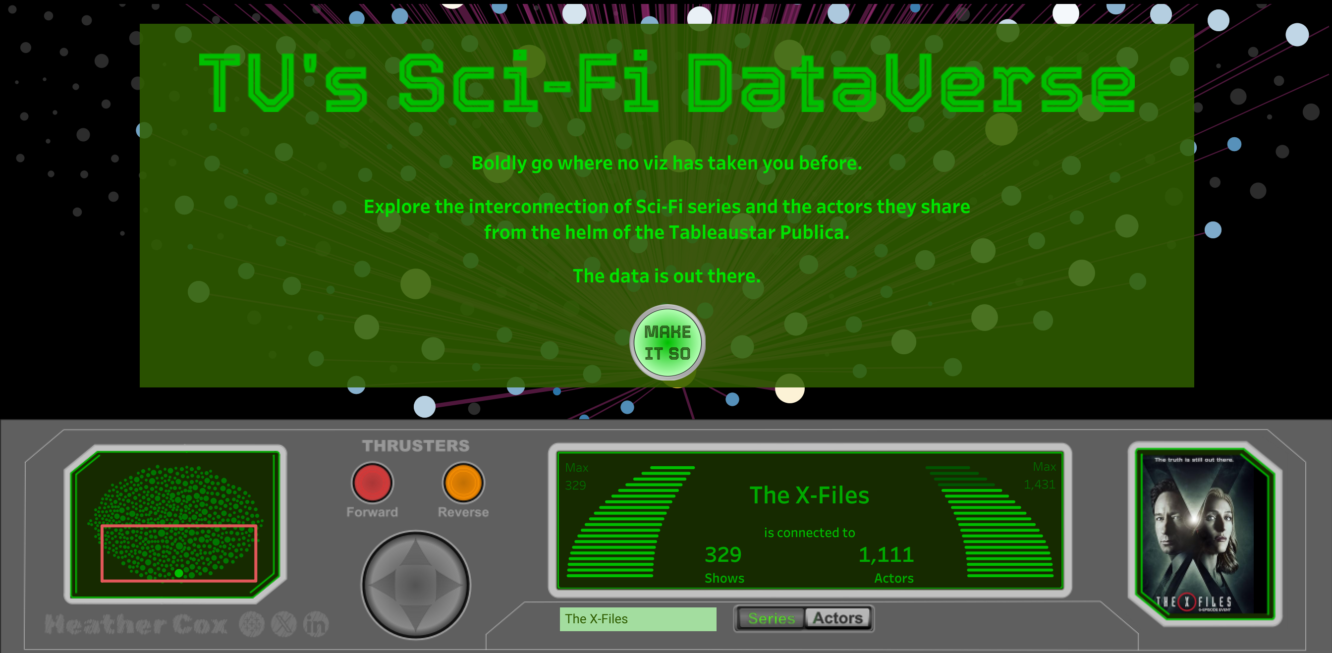
TV’s Sci-Fi DataVerse on Tableau Public
Kimly: You were named TableauNext a couple of years ago (Heather: actually, it was 2024) and most recently this year selected as Tableau Public Ambassador, you have four viz of the days and you have even written a guest post on the Flerlage twins’ blog – you have achieved so much in a short amount of time! What’s next for you?
Heather: I am terrible at goal setting! My aim for last financial year was to get involved with the community and improve my Tableau skills by publishing a few things to Tableau Public, and everything else just seems to be a natural consequence of that. I have some ideas for new ways to use some Tableau features that I will be excited to share, if I ever get them working. But mostly, I think I’ll be building on last year’s goals – stay involved with the community, and keep improving my Tableau skills.
Kimly: And lastly, who are some inspiring women that you follow in the data viz community?
Heather: Agh! So many, I’m bound to forget somebody important! Lisa Trescott, Sarah Bartlett, Alli Torban, Miriam Quick and Stefanie Posavec, Gabrielle Merite, Alison Pitt, Lindsay Betzendahl, Asha Daniels, Maureen Okonkwo, and Sadia Ahmed. And of course, the awe-inspiring work of a certain 13-time VOTD recipient…
****
Thanks so much, Heather for your insights. You won’t want to miss out on any new vizzes Heather publishes, so follow her on X and Tableau Public.
Kimly
