

14min read
After a bit of a break, she will viz is back with an interview with one of this year’s newest Tableau Public Ambassador and my pick for the biggest growth over the last 12 months, Victory Omovrah.
Kimly: Firstly, big congratulations on being named a Tableau Public Ambassador. You have applied yourself this past year, and produced some really standout vizzes. Let’s start at the beginning. What did your path into data visualisation look like? What drew you to data and data viz and by extension, Tableau?
Victory: Thank you so much 🤗. I am truly grateful for the experience so far.
My data analysis career path began after graduation. Although I studied Biology Education at university and graduated with a first class, I realized that, since high school, I had always been better at calculations than theories. This inclination toward something else led me to data analysis. With the rise of tech courses, I researched various options and stumbled upon data analysis. After thorough research, I sought a free course since I could not afford the required fees in dollars. Fortunately, I found Cybersafe Foundation, which offered an introductory class on data analysis using Excel and SQL. This sparked my interest further, and I explored short online courses on SQL from Coursera, LinkedIn, DataCamp, and SoloLearn.
At one point, I was torn between choosing Power BI and Tableau, but I eventually settled on Tableau. I took a Tableau course with Simplilearn, but shortly after, I paused my Tableau learning. I continued studying SQL and Python through DataCamp. Late last year, I became more active on Twitter (now X) and came across captivating visualizations by the DataFam (I didn’t know this was the name for it then 😂). I reached out to Gbolahan Adebayo and shared my concerns about not knowing which data skills to focus on. He encouraged me to pursue Tableau despite my fears and feelings of inadequacy. He introduced me to his earlier visualizations and showed me others, which gave me the boost I needed to start. Shout out to GB!
Being an ambassador gives me a platform to inspire others, share knowledge, and continue learning.
Kimly: Since starting out in your journey, I can see that you have evolved and grown in your data viz and data storytelling skills. What has helped you to nurture that growth?
Victory: One thing that has significantly improved my data storytelling and visualizations is my drive to constantly improve. Additionally, the DataFam has been a tremendous help in this journey. Their vizzes inspire me to keep pushing myself to do better. The ability to reverse-engineer a viz, study the calculations and charts without needing to contact the authors, has sharpened my Tableau skills and calculations.
Another helpful resource has been exploring Tableau Public vizzes and browsing through different sections, such as trending, arts and culture, and more. Websites like Behance, Pinterest, and Dribbble have also greatly inspired some of my visualizations. Together with Figma, all these resources have helped me refine the vizzes on my profile.
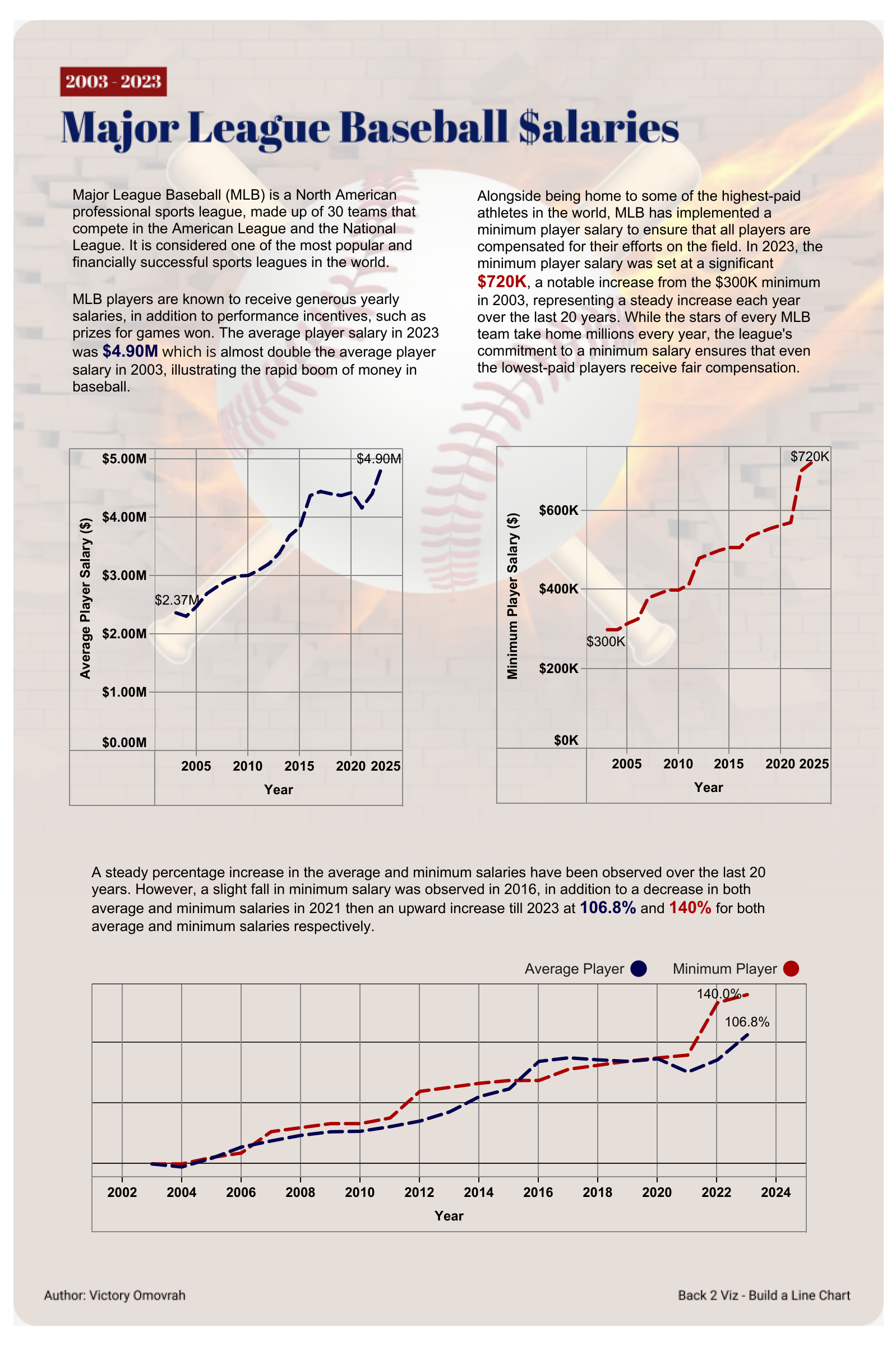
Major League Baseball Salaries on Tableau Public
Kimly: Do you have any advice for any new members of the data fam who are looking to grow their skills?
Victory: I would advise them to start from where they are, publish their vizzes, and share them on social media. Most times, we are afraid of failure and feel we need to be perfect before showing our work to the world, but you can’t become a star if you remain hidden. Put yourself out there, be open to feedback, and apply those corrections in practice.
Furthermore, I would also advise them to find their own unique voice. It’s good to borrow ideas (please credit the authors), but it is important to bring out your unique self in your visualizations. I remember talking to Kimly about how she makes her vizzes so distinct, and she said it comes from building on things she enjoys. That has really helped me too. In the quest to be the best like the top creators, do not lose your individuality. As they say, variety is the spice of life. We want to see you and your uniqueness.
Lastly, always be ready to learn something new with each of your visualizations (Kimly taught me this too 😃). Confused about how to implement a feature in Tableau? Find a dataset (Tableau challenges like Makeover Monday, Back2VizBasics got you covered 😉) and resources, and practice! You will learn better through hands-on experience. I would say you are just one practice session away from mastering that feature.
Kimly: And just recently you were announced as a first time Tableau Ambassador, what does getting a recognition like Tableau Ambassador mean to you?
Victory: To be honest, I never saw it coming. It was a huge surprise, and I was so excited! 😆 I literally screamed when I got the email. Becoming a first-time Tableau Ambassador is truly an honor and a humbling experience for me. It is more than just a title; it is a recognition of the contributions I have made to the DataFam community, and it reinforces my passion for data visualization. Being an ambassador gives me a platform to inspire others, share knowledge, and continue learning. It is a reminder that the work I am doing is valued, and it motivates me to keep growing and supporting others in the community.


I remember when I started officially earlier this year—I was so scared about whether I would be accepted or not. This recognition reassures me that I am warmly accepted by Tableau and the DataFam community at large. I want to say a huge thank you to the DataFam community and Tableau for this recognition!
Kimly: I know we spoke a little while you were planning and building this viz, but I want to delve deeper into your Nigerian Movie Directors viz. I learnt a lot about Nigerian films through your visualisation. What was your main goal in creating this viz? What did you want others to take away from your viz?
Victory: I am glad you found the visualization insightful! The reason for choosing this topic was my keen interest in shining a spotlight on my country, Nigeria. My main goal in creating the Nigerian films visualization was to highlight the evolution, diversity, and global impact of Nollywood, one of the world’s largest film industries. I aimed to showcase key trends, including prominent filmmakers, popular genres, and the industry’s growth over time. Through this viz, I hoped others would develop a deeper appreciation for the scale of Nigerian cinema, its cultural significance, and its influence on global entertainment.
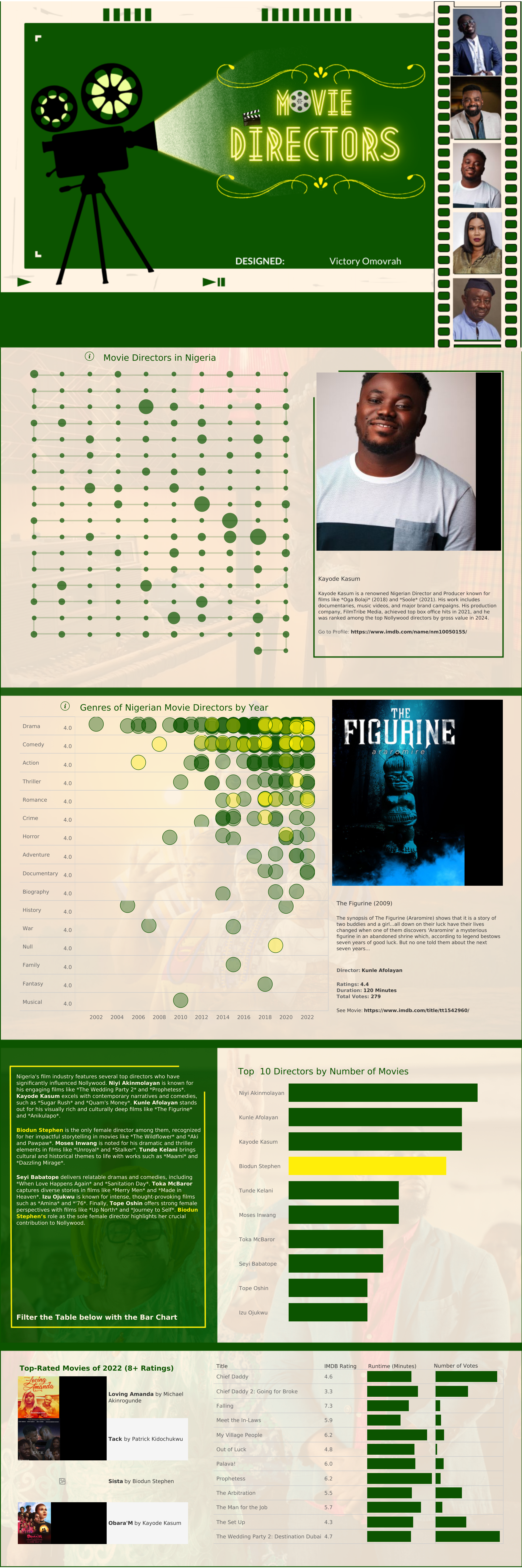
Nigerian Movie Directors #DataPlusMovies on Tableau Public
Additionally, I noticed the small number of female directors in Nollywood, which sparked my interest in digging deeper into the topic. However, over the past few years, there’s been a noticeable increase in female directors, and I’m pleased with this development. This motivated me to highlight a chart featuring the top 10 directors by the number of movies, where I realized only one woman—Biodun Stephen—made the list. She is an incredible director, with many of her films rated 8+. Notably, she directed “Aki and Pawpaw”, one of the most iconic Nigerian films, still widely discussed today. Another one of her films, “Sistas”, is also highly rated. She truly is a remarkable filmmaker, and I hope this encourages more female directors in Nigeria, who are equally creating great films.
I was also surprised to discover that a few Hollywood films have been directed by Nigerians. Most Nigerian films fall under drama, action, and thriller genres, with fewer in the musical and family categories. For anyone out there who’s skeptical about watching a Nigerian movie, this is your cue to dive in! 😎 Feel free to tell me your movie preferences, and I’ll gladly recommend some for you. 😃
Kimly: What would you say was the most difficult part of building this viz? And what parts did you enjoy the most?
Victory: The most challenging part was building the timeline chart. 😂 Initially, I used the years for the movies, but I soon realized some data was missing due to overlapping years. This meant certain movies did not show up because the chart could not display more than one movie from the same year. As a result, only one movie was visible for each year. To fix this, I switched to using the directors’ names in alphabetical order for the timeline, and that gave me the desired outcome.
Another hurdle was that the Data+Movies dataset lacked URLs for the directors’ images and short biographies, which were essential to the visualization. I wanted viewers to see the directors’ faces and learn more about them. This led me to research the directors’ images and bios, which I then manually added to the dataset. Although this took a while, it was definitely worth the effort! 😃
I also struggled with choosing the background design for the visualization. I knew green had to be included to represent Nigeria, but I could not quite decide on the right color combinations or the overall design.
The part I enjoyed most was setting up the filter actions. When you click on the timeline, it displays the director’s image and biography—same with the genre section. Although I faced some difficulty finding images for a few directors who keep a low profile, the filter interactions made the viz more engaging. I also loved the knowledge I gained from the process. While I was familiar with most of the movies, I did not know much about the filmmakers or the titles of their films, so it was a great learning experience for me. Lastly, the stage light shining on the title in the cover page was really captivating to me 😄
Kimly: It’s such a nice, cohesive design. All elements look intentional – everything has its place and fits really nicely with the theme. What was your inspiration behind the design?
Victory: Thank you! I am glad you appreciate the design. The inspiration behind it was deeply rooted in the Nigerian film industry, popularly known as Nollywood. I wanted the design to reflect the vibrant, diverse, and culturally rich nature of Nigerian cinema.
The green color scheme was intentional—it represents the Nigerian flag, symbolizing the nation’s natural wealth and growth. I incorporated film elements like the projector and film reel to give the visualization a classic movie theme, reminding viewers of the cinematic world we’re exploring. The use of directors’ profiles and biographies was crucial because I wanted to put a face to the names that have shaped the industry, especially with the timeline chart linking directors to their work.
The goal was to create an interactive and engaging experience where users could connect with the people behind the films, not just the movies themselves. It was important to me to highlight not only the quantity but also the quality of work, which is why I included top-rated movies and a focus on female directors, like Biodun Stephen, to inspire others.
Each visual element, from the timeline to the genres by year and top directors chart, was placed to guide viewers through the story of Nigerian movie directors in an organized yet creative way.
Kimly: If you could go back and build this viz again, would there be anything that you would do differently?
Victory: Honestly, not much. However, there was a point when I considered changing the scatter plot to a chord chart. I thought it might give a different visual perspective, but in the end, I felt the scatter plot worked just fine and communicated the information effectively. So, I’m happy with how it turned out!
In the quest to be the best like the top creators, do not lose your individuality.
Kimly: I was reading about Nepadown and how you started it up in an effort to transform Nigeria’s energy landscape. Sometimes, in my part of the world, we take things like the internet and electricity for granted and do not realise that the rest of the world is not so fortunate. How has challenges like lack of electricity impacted your goals and how do you find the motivation to push through?
Victory: Living in Nigeria, where electricity is often unreliable, has been one of the biggest challenges in my data analysis journey. There have been countless instances where I’ve had to pause mid-project or shift deadlines due to power outages. It’s not something many people from other parts of the world have to contend with, but it’s a reality that requires constant adaptation. This lack of consistent electricity can be incredibly frustrating and makes it difficult to maintain the momentum needed to stay productive and achieve my goals.
Despite this, my passion for data analysis and its transformative power keeps me motivated. I’ve come to realize that data has the potential to drive change across industries, and that keeps me pushing through, even when the conditions aren’t ideal. I’ve learned to adapt by planning my work around electricity availability, using backup power solutions, and finding ways to stay productive during outages.
Being part of supportive communities like the DataFam and recently becoming a Tableau Ambassador has also been a significant source of motivation. I remember when I started officially earlier this year—I was nervous about whether I would be accepted or not. This recognition not only reaffirmed that I am part of a community that values my contributions, but it also drives me to keep growing, learning, and sharing my knowledge with others. Knowing that my work is appreciated and has an impact, even amidst these challenges, gives me the strength to keep pushing forward.
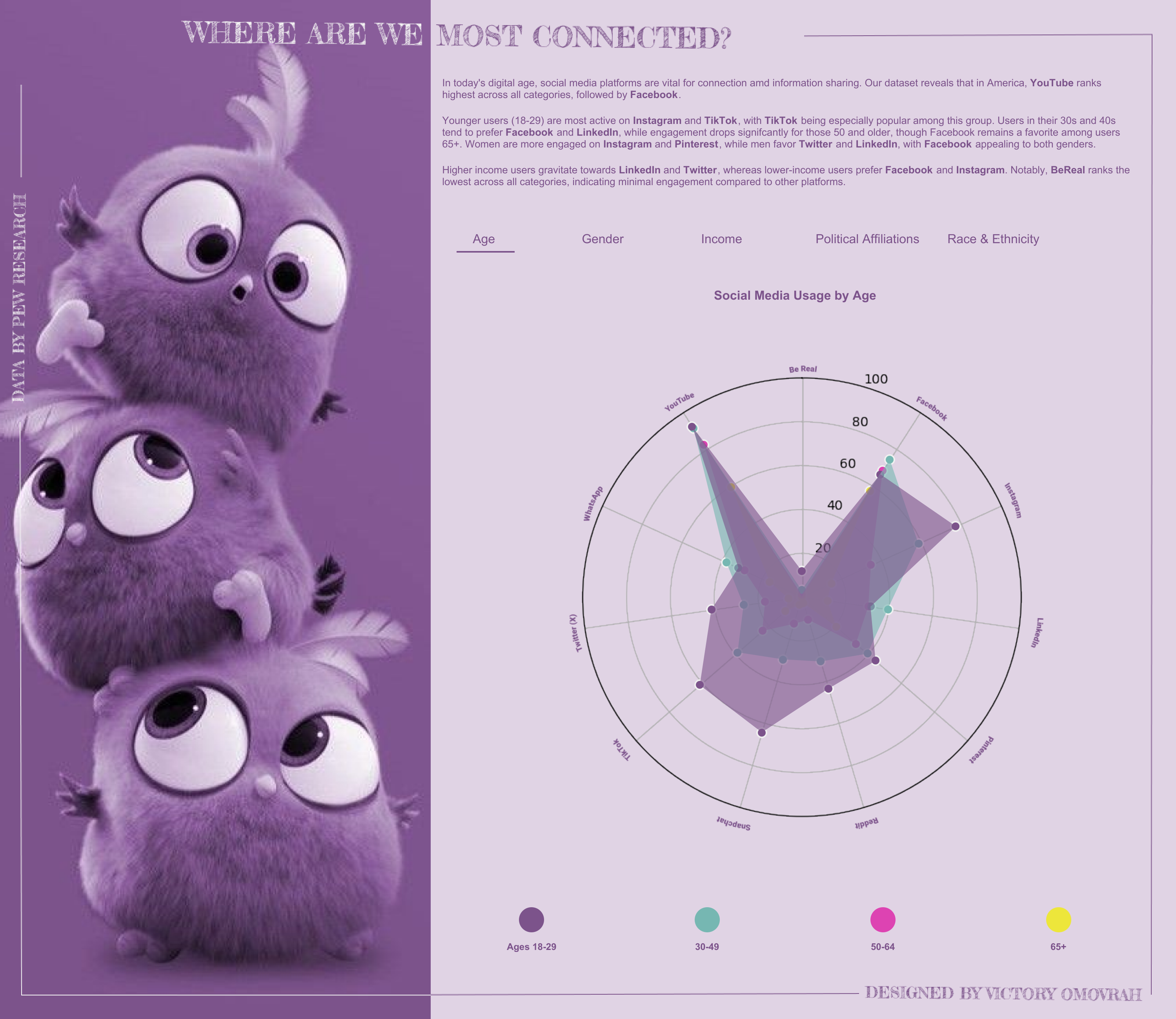
Social Media Usage on Tableau Public
Kimly: You’ve had such a great journey so far, what’s next for you?
Victory: Thank you so much. Earlier this year, I launched a YouTube channel to share insights and knowledge on all aspects of data, especially for newcomers. However, I’ve faced some challenges with my PC, which has been slow and unresponsive, affecting the progress of the channel. Once I upgrade my system, I plan to dive back in and continue helping others, as I understand how overwhelming it can be to navigate the data space without proper guidance.
Aside from that, I plan to invest more time in building impactful visualizations and enjoying the creative process. I’m also excited to put myself out there for any data-related opportunities, whether it’s webinars, talks, job roles, or collaborations. I want to be a source of support and inspiration for those just starting their data journey or looking to grow. I believe as I continue on this path, new opportunities and experiences will naturally unfold.


Kimly: And lastly, Victory, who are some inspiring women that you follow or look up to in the data viz community?
Victory: Thank you for this question! There are so many inspiring women in the data viz community who have played a significant role in my journey, and I’m incredibly grateful for them. While the list is long, I’ll highlight just a few.
First off, I have to mention you, Kimly Scott 😃😃! I’ve always admired your visualizations, and after seeing you present at the TC24 conference, I knew I had to connect with you!
Sarah Bartlett is another incredible woman in data—she’s always so kind and willing to help everyone. Lisa Trescott has a talent for making data analysis not just insightful but also visually captivating! Shreya Arya brings such a unique flair with her use of colors, which I absolutely love. Lindsay Betzendahl’s website is my go-to for inspiration, and Ellen Blackburn’s business dashboards are simply next-level.
I can’t forget my fellow Nigerian women in the data viz community. Omokehinde Ayodeji is always just a message away, even if it’s late at night 😁. Maureen Okonkwo consistently wows me with her business dashboards, and Zainab Ayodimeji is always willing to help the Nigerian DataFam. A big shoutout to Ella Tudome for being an inspiration too! ❤️
***
Thanks for sharing you experiences and motivations with us, Victory. Victory is one to watch, so give her a follow on X and Tableau Public.
Kimly
