
11min read
she will viz is back for 2024, and our first interview for this year is with rising star and uber talented, Shreya Ayra. Shreya holds six Viz of the Day titles, recently joined the stellar team at Back 2 Viz basics and has also recently graduated from the Data School UK.
Kimly: Thank you for sharing your story with she will viz Shreya. I’m so inspired by your creativity and talent. Firstly, congratulations again on graduating from the Data School! What a great accomplishment! What did your path into data visualisation look like? What drew you to data and data viz?
Shreya: Thank you so much, it’s been such a great experience going through training! I’m excited to grow my knowledge and skills through my client placements now!
Before joining the Data School, I had recently graduated from university with a Master of Chemistry degree. My favourite part of my degree was working with data and being involved in each step of the process – from collecting data in the lab, to analysing it and forming conclusions, and finally being able to present my findings back and hopefully create a change and impact in that way.
After graduating, I was unsure whether to stay in Chemistry, or shift towards a more data-focused career. My brother was hugely encouraging and supportive as I ultimately decided to explore opportunities in data.
While applying for jobs, I came across the Data School! It seemed like a really interesting role, although at this stage I had never heard of Tableau or Alteryx. The application process was very hands-on and this was my first exposure to Tableau. I loved how interactive the software was and how quickly I was able to uncover insights in the data. I am a very visual learner, and so being able to “see” the data in such a way really piqued my interest!
Kimly: The Data School has some very famous alumni! What were the standout learnings from the Data School for you and what did you learn in terms of your abilities that perhaps you didn’t realise you had?
Shreya: One of my standout learnings from The Data School, thanks to Carl’s guidance, is the importance of beginning with a plan. Admittedly, sometimes I forget to do this, but when I do initiate tasks with a plan—whether it be for data prep or creating visualisations—everything tends to flow more smoothly and efficiently. So always start with a plan, it will make your life so much easier! (Note to self)
Instead of measuring yourself against others, it’s better to take a moment to reflect on your current work in comparison to your past creations.
Another standout lesson was on the importance of defining requirements. By asking clients open-ended and well-structured questions, you position yourself in a good place to gain a clearer understanding of their business objectives and what they aim to achieve. This enables you to provide more effective and customised solutions to meet clients needs and expectations.
What I admire about the Data School, is that each person has their own strengths, be it in design, communication, data prep, or technical skills…. and because of that, there’s so much you can learn from each other. Everyone kind of inspires me in a different way, and it’s really cool working in a place with such a diverse range of talents!
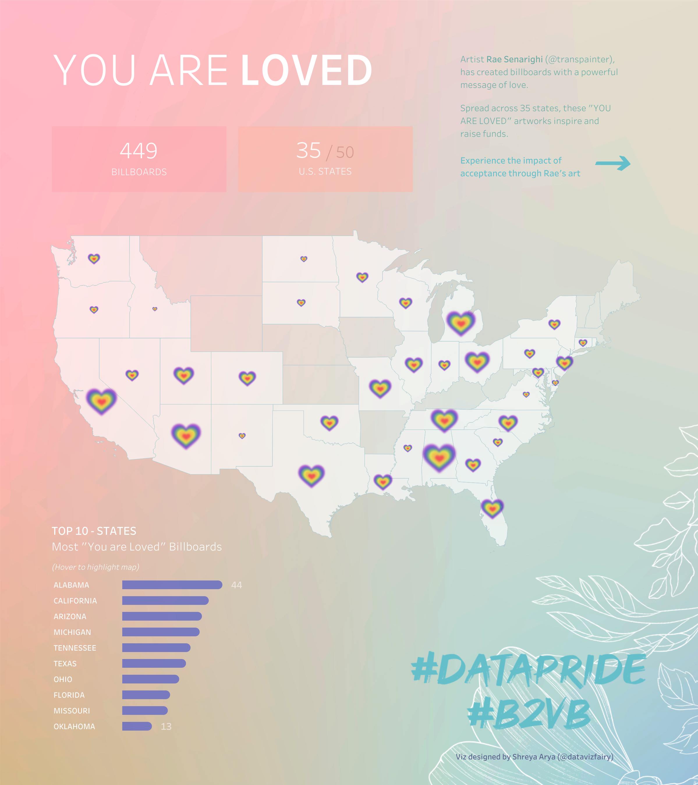
You Are Loved | #DataPride – Back 2 Viz Basics on Tableau Public
Kimly: What advice do you have for people thinking about getting started with data viz or studying data viz?
Shreya: My advice to anyone getting started or studying data viz would be to make it a habit to practise regularly and seek feedback on your creations.
Participating in community challenges such as Back 2 Viz Basics, Makeover Monday and Workout Wednesday are all great opportunities to both learn and establish new skills and techniques. And by asking for feedback on your work, you’ll be able to engage with other skilled users in the community, and pick up some new tips & tricks that way!
Also try not to compare yourself to others, as it’s not always an accurate comparison. Everyone’s journey is unique. Some people may have had more experience using the software, different backgrounds, skill sets, strengths, areas of improvement…
Instead of measuring yourself against others, it’s better to take a moment to reflect on your current work in comparison to your past creations. In doing so, you’ll notice just how much you’ve grown over time!
Kimly: One word I can use to describe your data visualisations is “beautiful”. You have this kind of enchantingly whimsical style with the use of soft colour palettes and gorgeous imagery, how did that style come about?
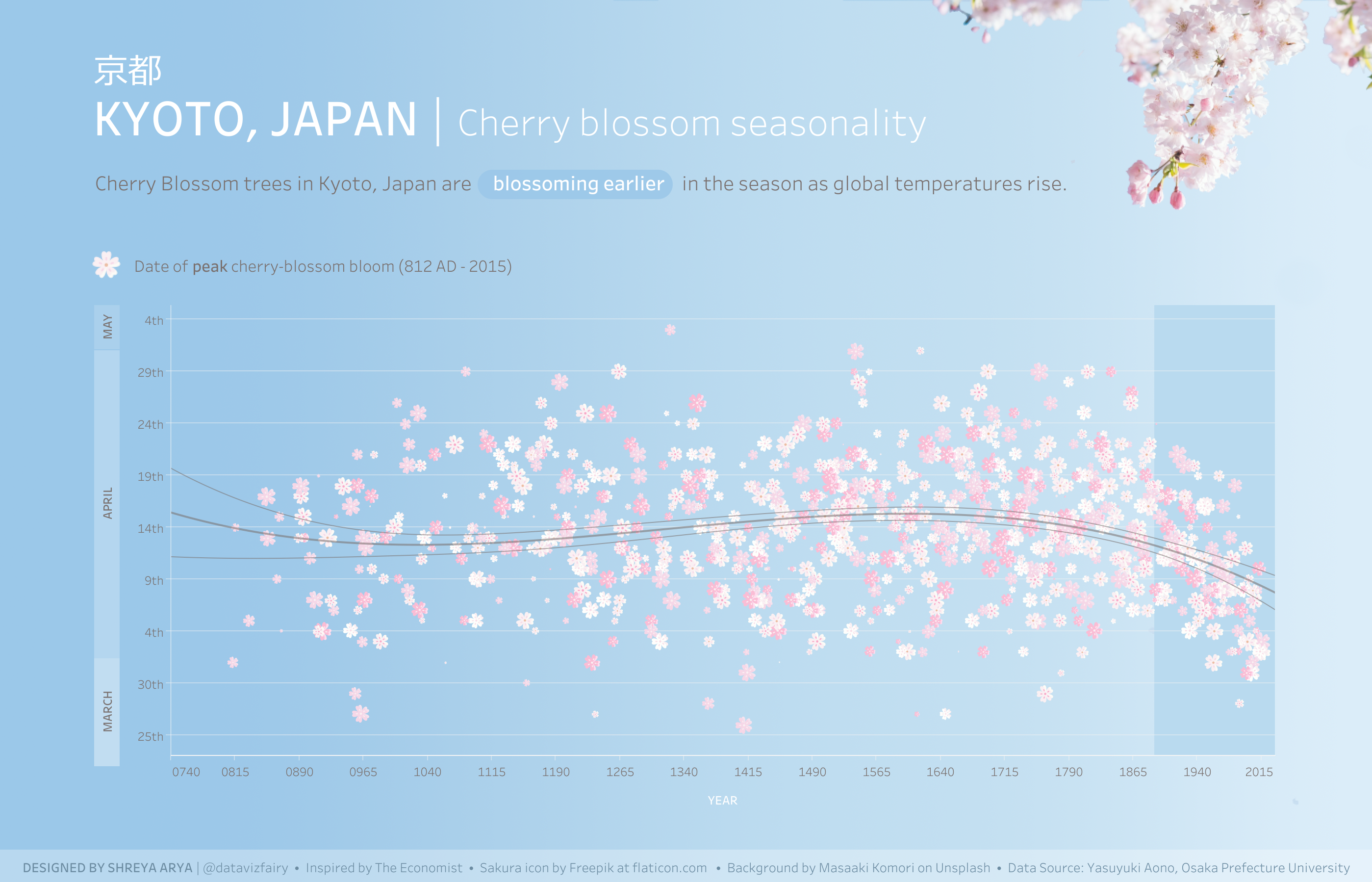
KYOTO, JAPAN | Cherry blossom seasonality | #B2VB | VOTD on Tableau Public
Shreya: Aww thank you, that’s such a kind compliment!!
I think my style is very much influenced by my other creative endeavours and interests.
In my spare time, I love playing with other artistic mediums, such as watercolour painting, jewellery making, crocheting, clay, music, poetry… I also enjoy reading about fantasy topics such as mythology and folklore. It’s quite a contrast to the more analytical, Chemistry background that I have.
Creating visualisations using Tableau, for me, is like another form of artistic expression, as there is so much you can do in terms of customisation and creativity.
It allows me to blend my creativity with my analytical skills to create something that’s visually beautiful and insightful, and that’s something I find really enjoyable!
Kimly: I want to talk about your viz, Endometriosis IVF Outcomes that you did for #ProjectHealthViz. The viz is a perfect example of how one can balance data and information with aesthetics and images. How do you balance needing to show the data with making something that looks beautiful?
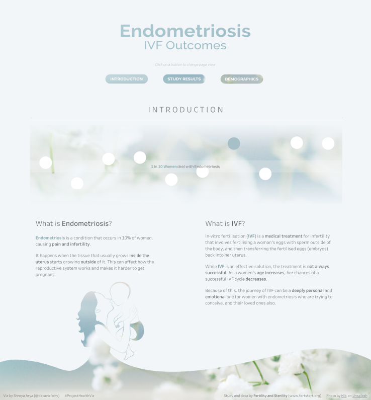
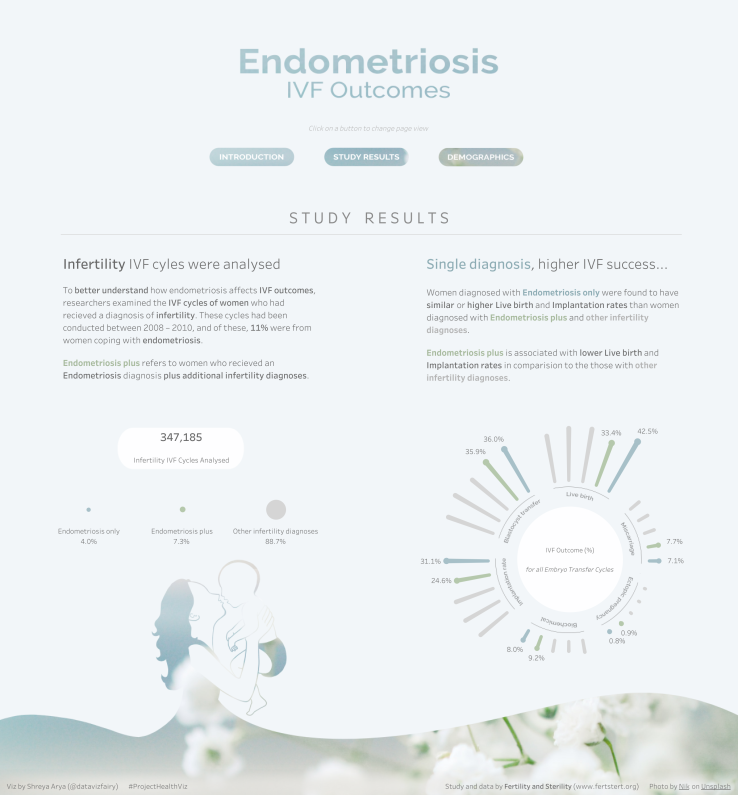
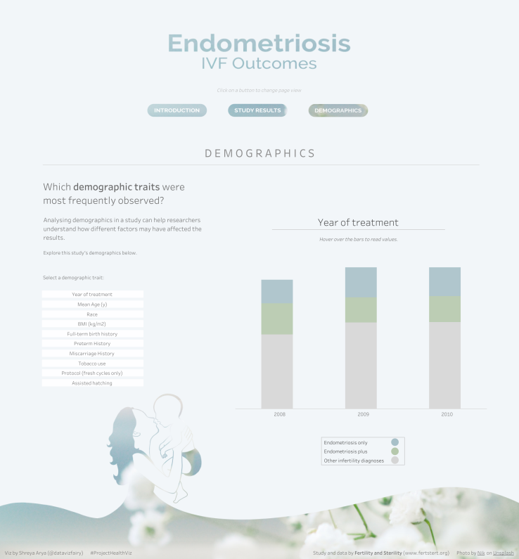
Endometriosis IVF Outcomes | #ProjectHealthViz on Tableau Public
Shreya: The most impactful data visualisations I have seen always understand the balance between creating something that is visually-pleasing, yet informative and insightful.
When creating visualisations, I like to regularly reflect on what I’m doing using questions, such as: Is my viz telling an interesting story? What information can the user take away from this? Does the layout feel clear / Is it too overwhelming? These reflections guide me and allow me to identify areas of improvement.
Sometimes it can be difficult to assess whether that balance is there or not. My advice if you’re ever unsure, is to ask a friend for some feedback. This gives you a fresh perspective on your work, and their feedback can help align you to your goal of creating something informative yet beautiful.
Kimly: What was the inspiration for the design elements in this viz? The colour, the images, the style?
Shreya: For many women diagnosed with Endometriosis, the journey from the initial diagnosis, to the possibilities of conceiving through IVF is a very emotional one. In my viz, I wanted to incorporate colours that capture those emotions tied to this diagnosis.
I feel that muted colours, such as blues and greys, convey the depth of those emotions. IVF on the other hand, is a medical procedure that can bring hope and optimism to many women diagnosed with endometriosis, who dream of having their own baby. The colour I associate with hope is white.
Early on in the design process, I knew that I wanted to incorporate some form of floral imagery into this viz. While searching on Unsplash, I came across this beautiful image of baby’s breath – this is the image I chose to feature within the design of my viz.

Baby’s breath flowers are associated with hope, innocence and new beginnings, so I felt this flower resonated perfectly with the topic. This image also contained the exact colour palette I had in mind, with shades of blues and whites.
Kimly: Is this how you envisioned the final viz to look when you first started? Did you have many iterations along the way?
Shreya: The final viz is pretty close to what I had initially planned out in terms of the charts I used, the colour palette, and the information. Although, the design did go through a few iterations.
Initially, I was aiming to fit all the information onto one dashboard, however from my perspective, it was starting to look a bit overwhelming as there was so much information – it was becoming difficult to focus on one section at a time. This prompted me to split it up into separate dashboards and views.
I also experimented with a few variations of how I wanted to incorporate the baby’s breath image into the viz, before settling on the final design.
I always anticipate the design of my viz to slightly evolve or develop during the creation process, as you may identify a few areas of improvement or think of some new ideas to improve your viz. It’s all part of the process 🙂
Kimly: I’ve noticed the absence of long form vizzes on your Tableau Public profile – you tend to go for single screen vizzes, and this viz is no exception. Here, you’ve opted for buttons to change the view which I think is quite engaging. What was the reason behind this design choice?
Shreya: Great observation! For me, designing single-screen vizzes feels more intuitive. I like being able to see everything in the view at once, and seeing how the visual elements play off of each other, to create a cohesive look.
In this instance, by dividing my viz into three views, it allowed me to group relevant information together to tell a story, without overwhelming the user. This approach also allowed me to keep the “Endometriosis and IVF Outcomes” title visible, ensuring that users can always refer back to the main topic.
From a user perspective, I feel this approach also minimises the “mindless scrolling effect”, often associated with lengthy content. By presenting information on a single screen, the user can absorb all the information at once, with ease. And if the initial page captures their interest, they’re naturally inclined to explore further.
There’s also a comforting feel to it, like flipping through a storybook, which I really like.
Creating visualisations using Tableau, for me, is like another form of artistic expression, as there is so much you can do in terms of customisation and creativity.
Kimly: There’s lots of information in the viz in terms of endometriosis and IVF outcomes, did you do any additional research into endometriosis or IVF when putting together this viz?
Shreya: This was actually my first time learning about Endometriosis! Before this #ProjectHealthViz challenge, I wasn’t aware of this diagnosis and its impacts. I’m grateful to have had the opportunity to learn so much about it through this challenge and creating this viz.
Before diving straight into the creation process, I wanted to gain a deeper understanding of the study and the topic of Endometriosis and IVF first.
My initial steps involved reading the Endometriosis paper from which the data was sourced. I wanted to comprehend how the data was collected, what the findings were, and what implications and outcomes this may have for women diagnosed with Endometriosis.
Afterwards, I then went on to clarify and understand any medical terminology used in the study or that is relevant to the topic. Since my intention was to create a viz aimed at a general public audience to raise awareness of the diagnosis, I wanted to ensure I could translate complex medical concepts into more accessible, and understandable language.
I also iterated based on feedback from others in the community, who had personal experiences with Endometriosis and IVF. Their insights really helped me fine-tune the viz and make sure it was as informative and genuine as possible.
Kimly: In addition to creating beautiful and creative vizzes, you are also adept at building business visualisations. You have two Viz of the Days for your business dashboards. How much importance do you place on having business dashboards on your Tableau Public profile?
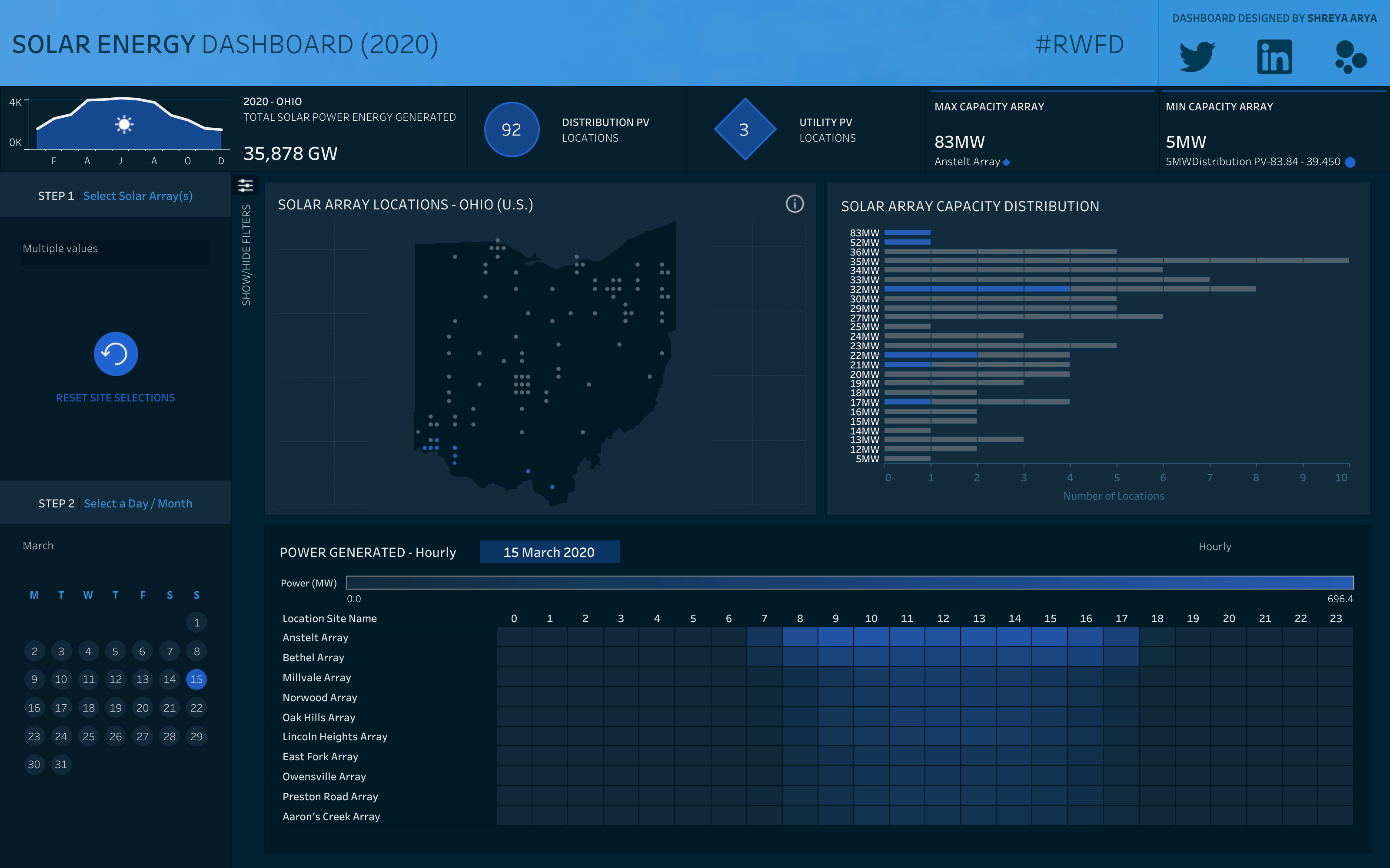
Solar Energy Dashboard | #RWFD | VOTD on Tableau Public
Shreya: I would say it’s important to be able to showcase that you have the skills to create business dashboards through your Tableau Public portfolio, especially as it allows you to demonstrate the value you can bring to clients. I definitely plan on creating a few more business visualisations for my Tableau Public.
The thought process behind creating a business dashboard is significantly different to building a more creative viz. I really feel that being able to demonstrate your versatility as a data visualisation creator is so valuable and powerful.
Kimly: What are some things that you need to be aware of when designing and building business dashboards that may not be so relevant when building say something for Makeover Monday which may be more creative driven?
Shreya: When designing business dashboards, it’s important to center your design around the end user, as they are the ones who will be using the dashboard to make key decisions. This includes being intentional about the chart choices you make, and ensuring each chart and visual serves a clear and meaningful purpose.
It can be helpful to put yourself in the user’s shoes by asking questions such as: What’s the main goal of this dashboard? Which metrics would be most valuable to the user? How do I want them to interact with this dashboard?. These kinds of questions can help guide you in your design decisions. Crafting a User Story can also help you in understanding your client’s needs better.
Another important aspect is being open to feedback, and making iterations based on user feedback. With business dashboards, you may need to make updates or improvements in order to better serve users and evolving needs.
In comparison, with creative visualisations, you have more freedom and space to experiment with new designs, colours and techniques. I feel the goal of more creative visualisations is to captivate your audience while delivering insight, so here, you may focus more on creating visually appealing charts that grab attention.
Kimly: And lastly Shreya, who are some inspiring women that you follow or look up to in the data viz community?
Shreya: Oh, there are so many incredible women in the data viz community who’ve really inspired me along the way. I’m so grateful to be able to learn and grow alongside such talented and supportive women in the industry.
While I wish I could name everyone personally, I’ll highlight a few amazing women who have made a lasting impression on me.
Elisa Davis has been such a guiding light in the community, particularly through her work with B2VB. She’s always been there with a helping hand and valuable guidance, especially when I was just starting out with B2VB. I find her incredibly inspiring!
My data school coach, Jenny Martin, also has been a huge source of inspiration to me. She’s not only taught me a great deal about data visualisation and the community, but she’s also been incredibly kind, supportive, and encouraging every step of the way.
And of course, I can’t forget to mention you, Kimly.
Your visualisations and style have always been a huge inspiration to me! I remember when I first started exploring data viz, I came across your profile and was completely blown away by the beauty of your work. The way you use colours and handle sensitive topics with grace is truly inspiring. Thank you!
***
Right back at you, Shreya! I’ve learnt so much from this interview. Follow Shreya on Twitter and not only will you see inspirational data viz, but as a bonus, you will also be treated to the wonderful tips she provides for Back 2 Viz basics each round. And for even more inspiration, do not forget to follow Shreya on Tableau Public too!
Kimly
